Let us leave off with the animals for a bit,
and return to my decoratin'!!!!!
I have shown you guys the behind the scenes process of creating custom lampshades.
Sooooooo.......
I will now show you the custom lampshades in the rooms I designed for my buddy Kris.
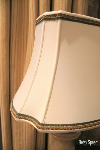
Above is a lamp that used to be in her living room that we moved to her master bedroom.
One of the advantages of having a house with color schemes and styles that flow from room to room.....
is the ability to move your stuff around,
and have it work!!!!!
Living Room Entry Hall Dining Room
Kitchen Upstairs Hall Master Bedroom
All these rooms flow, that's why I was able to pull the little chair from the upstairs hall to the side of Kris's bed.
In the above picture, we put the lampshade from the living room lamp on the alabaster lamp by the bed.
It was a temporary fix until we could have new lampshades made.
Sooooo...
here's the new shade...
Ta Daaaaa!!!!!
We chose trim that picked up the gold and green of the room.
And decided on a octagonal shape for the pair of lamps.
Here they are in their new home.
They were sized a little smaller than the other lampshade.
Here's a side by side.
This shows how just an inch or two can make all the difference in scaling a shade.
The picture on the left is blurry, 'cuz, once again I blowed something up.
Damn those pixels!!!!!
Now let's go into Kris's guest room
This room is a departure from the rest of the house,
and therefore,
Nothing from the rest of the house can go in this room.....
and nothing from this room can go in the rest of the house!!!!!
I had a shade from Home Goods kickin' around that I placed on the lamp resting on the chest of drawers.
I thought it was just fine and dandy.
However....
Kris wanted another shade.
Don't tell her, but she turned out to be right.
The new shade makes a big difference.
Even though the shape and size are similar, the strong color or the trim pops the impact of the shade.
It doesn't blend into the wall any more, but stands out.
We chose green pink and white ribbons for the trim.
I wanted a vintage feel, so I chose the more old fashioned shape.
I wanted it to feel like we had found it in a junk store.
(a very expensive junk store........)
I love the way the flowers from the lamp pick up the flowers from the plate that pick up the flowers from the wallpaper that all go with the trim on the lamp..................
We are getting this room close to completion, we've received the toss pillow covers for the bed, and I am in the process of cutting off alllll the tassels.
So, that's what I will show you guys next time.
On that note,
Latah, Gatah


b.jpg)


.jpg)


0 comments:
Post a Comment