Ok, almost ready to show you the final kitchen plan!
But before that let's look at the last section of the kitchen - the office.
Here is what the office looks now...
But before that let's look at the last section of the kitchen - the office.
Here is what the office looks now...
And here are my inspirations ...
I like the white of course and the smaller drawers as well as having the main 'office part' in the middle.
This is similar to the first photo but take note that the cabinet goes all the way up the ceiling
which I like too.
 |
| source |
I like this because I want a display shelf similar to this for the middle cabinet.
 |
| source |
This one shows the over-all feel I want for that area.
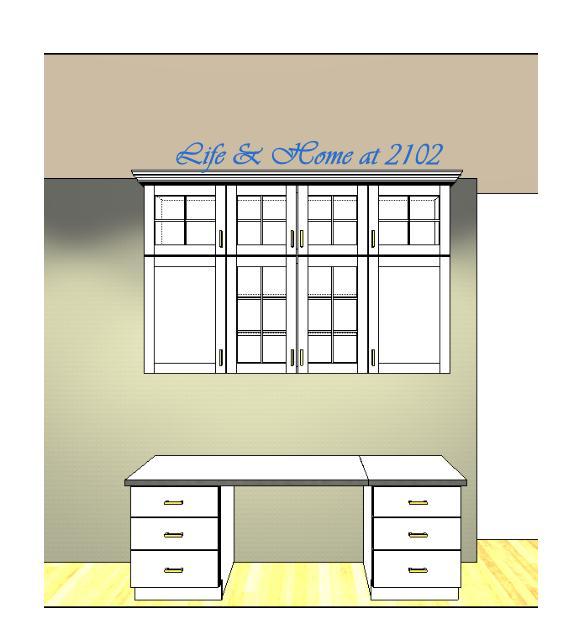
And here are the design rendering by Heather Lapham from E.A. Knight Construction.
This first design looks ok, however, we have a 27" MAC and I think the space above it might be too close to the monitor. Also I wanted the table counter height. That way, I could watch a movie or video while cooking and also supervise my son as he does his online therapies.
I also wanted a cabinet on the right for the printer instead of drawers.
I also wanted a cabinet on the right for the printer instead of drawers.
After some tweaking, here is what the final cabinet/area will look like...
The shelves in the middle will be all glass and lit up from above.
Notice too all the drawers and the printer cabinet on the right.
I know I'm a bit O-C on every little detail and Heather thankfully, is very patient with me and my continuous changes and requests.
I just want to make sure I do it right for us.
I just want to make sure I do it right for us.
We're almost done with the design process!
If you want to see the Plans for the Kitchen Island, Click here, and for the Plans for the Pantry Cabinet, click here. And if you want to see what the entire Kitchen looks like now, CLICK HERE.
Would love to hear your thoughts! Please share away...
If you want to see the Plans for the Kitchen Island, Click here, and for the Plans for the Pantry Cabinet, click here. And if you want to see what the entire Kitchen looks like now, CLICK HERE.
Would love to hear your thoughts! Please share away...
Have a Nice day!
Linking back to these wonderful parties..
Nifty thrifty Tuesday - Lindas coastal charm
Sunday Showcase 196 - Under the table & dreaming
Make it Pretty Monday 51- The Dedicated House
Inspire Me Tuesday 166- A Stroll thru life
Tuesdays at our Home - Home away from home
Terrific Tuesday - Adventures of a DIY mom
Share it Link Party - Winthrop Chronicles
Brag about it Link party -VMG
Create & share - Trendy Tree House


0 comments:
Post a Comment